Turn outputs into adoption (and why you might need a designer)
Why some research projects spark change while others just... don't? It's not the research itself. The science is solid. The findings are groundbreaking. The final report ticks all the boxes, gets delivered on time, looks professional, and even gets a nice little mention during the annual forum. And then it sits there.
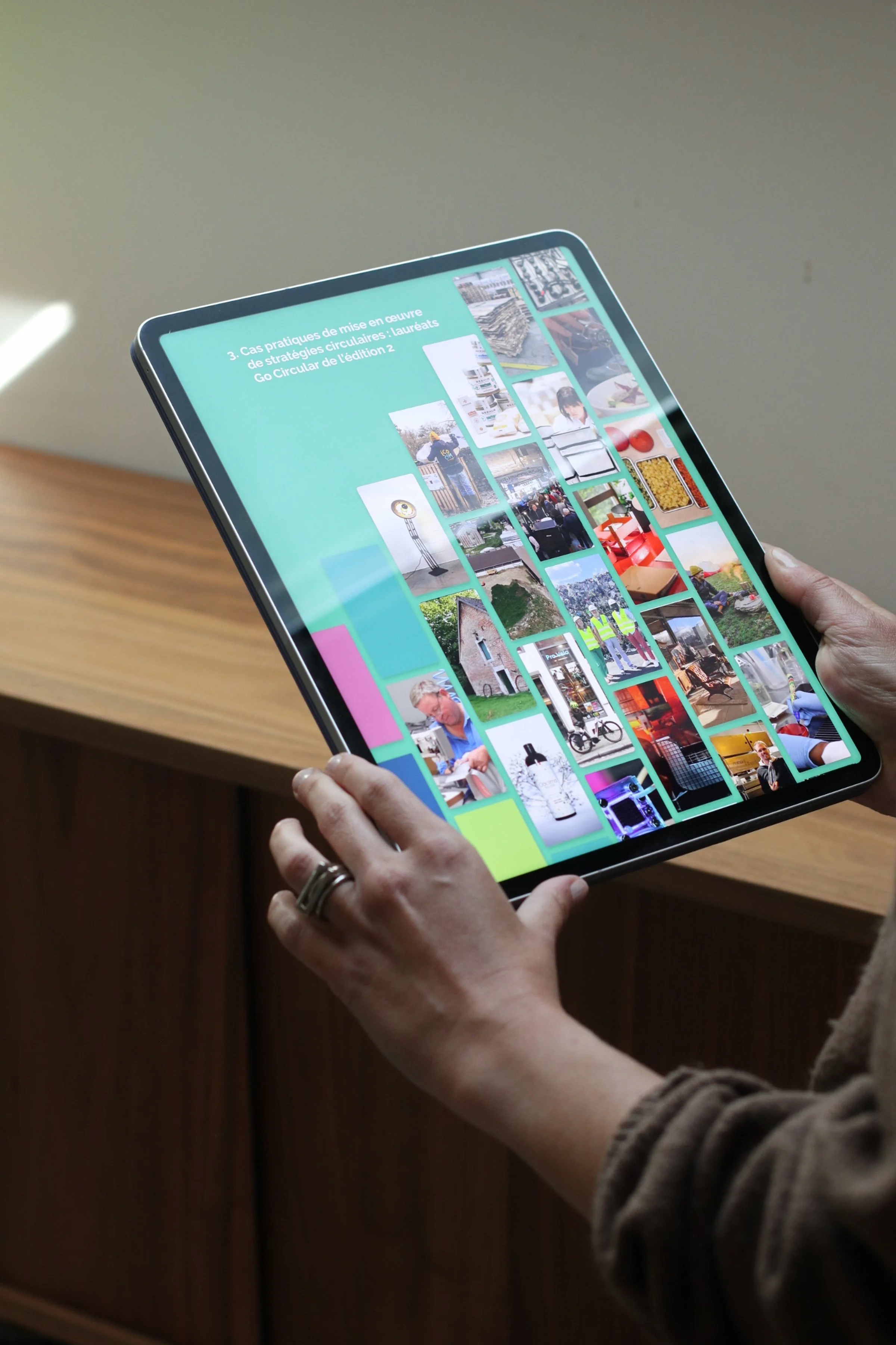
Nobody changes their behavior. The deliverable D7.23.3 gathers digital dust. The website gets a couple of visitors and then silence. The beautifully written and meticulously researched policy brief, never makes it past page three with the decision-makers it was meant for.
Here's what I've learned after years of designing engagement tools for climate and clean energy projects: availability doesn't equal adoption.
We work incredibly hard to create the deliverable content. In all that we forget to design for the behavior. We forget about what it actually takes to get someone to read the thing we put together.
The Commission's JRC is now advocating for integrating behavioral insights early in the policy cycle.
(Translation: the winning proposals of 2026 will engineer habits alongside their outputs. Not instead of. Alongside.)
So I made a cheat-sheet. Real examples from real EU projects like ENCLUDE and DECIDE. Tools that passed the three-question test I use now before finalising any design:
Which habit should change for our goal to happen?
How exactly does this tool make that habit-shift more likely?
If this works what will people do differently tomorrow?


The tools that make it onto the list aren't just pretty. They're designed to shift habits:
Serious games that make complex energy trade-offs tangible through play and repetition. (I designed one called Power of Community to get kids and caregivers talking about energy communities. It works because it creates dialogue, not only information transfer.)
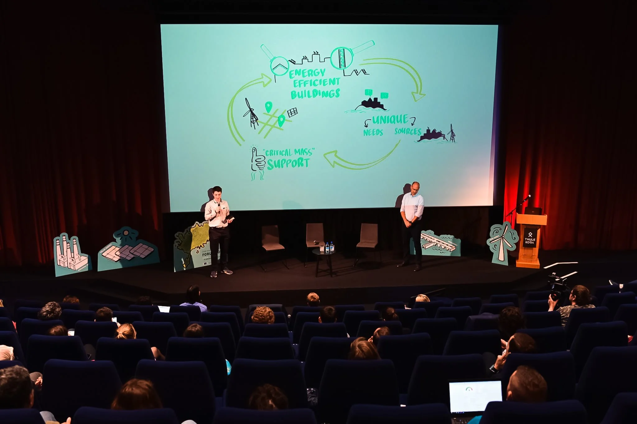
Graphic recording that turns three-hour webinars into visual summaries people want to share. (I join the sessions live, distill what's being said in real-time, and create something emotionally resonant that sticks.)


Policy briefs with visual hierarchies that guide decision-makers' eyes exactly where they need to go. (Because if they can't find the insight in 30 seconds, they won't find it at all.)
Visual identities that build trust and recognition across a three-year project timeline. (Consistency matters when you're asking people to change how they do things.)


Here's what I wish everyone knew: communication designers aren't there to make things look nice. We translate complexity into clarity. We design feedback loops that reinforce positive behaviors. We create accessible materials across different literacy levels. We craft narratives that connect data to human stories.
We design for the trigger, for action and for change.
If you're writing a proposal right now, or you're six months into a project and realising your engagement strategy feels... flat, consider this: are you designing for availability or adoption?
Because research that changes the world needs to reach the world first. And reaching the world means designing for the messy, wonderful, complicated reality of how humans actually make decisions and form habits.
What about you? Have you ever caught this gap in your own projects? Delivered something brilliant that nobody ended up using?
Let's talk about it. Or better yet, let's work together to design something people will use.
P.S. The cheat-sheet includes all the "why with a designer?" answers with visual examples. Download it, share it with your consortium, use it when you're stuck on how to make your next deliverable something people will want to read.